
Product Design
Descomplica Mobile
Bringing notifications, accessibility modes and in-app guidance to a learning app used by more than 30,000 students.
- Company
- Descomplica
- My Role
- Product Designer, Mobile Squad
- Timeline
- Oct 2021 — Sep 2022
- Platforms
- iOS, Android
- Team
- Product manager, mobile engineers, accessibility team
- approval for in-app notifications in beta
- 80%
- lift in student activity in the app
- 20%
- increase in student satisfaction
- 70%+
Overview
Descomplica is one of Brazil’s largest online education platforms, with pre-university and entrance-exam courses, undergraduate and postgraduate programs, and learning platforms for corporate training — on desktop and mobile.
I joined the Mobile squad as Product Designer to introduce new features and raise the quality of the app experience. I worked end to end: running discovery with the product manager, turning ideas into flows and prototypes, handing off to iOS and Android engineers, and reviewing the build against the design.
The Challenge
The app lagged behind the desktop platform. Features students relied on there — like notifications about their courses and activities — didn’t exist on mobile, and there was no consistent way to tell students when something new arrived in the app.
The goal was to bring students back to the app more often and help them get more out of each study session, without adding noise to their day.
There was also a hard constraint: many of our students were on a tight budget and used older, entry-level phones. Whatever we added had to keep the app light and simple.
Discovery
Together with the product manager, I interviewed students who used the platform to understand their study habits, complaints, problems and what they valued in the app. Two insights shaped the squad’s roadmap:
Students study in the gaps of their day. Many were already working and studying for a second degree or a postgraduate course. They used the app on their commute, at lunchtime, even at the gym — short sessions, often on the move. That pointed us to features that fit those moments: audio versions of lessons they could follow without looking at the screen, dark mode for comfortable reading, and notifications so they could follow their progress and updates without opening the desktop platform.
New features went unnoticed. Students told us it was hard to know what had changed in the app. So instead of shipping more, we made sure what we shipped was discovered — which led to in-context tooltips for new features.
In-app Notifications
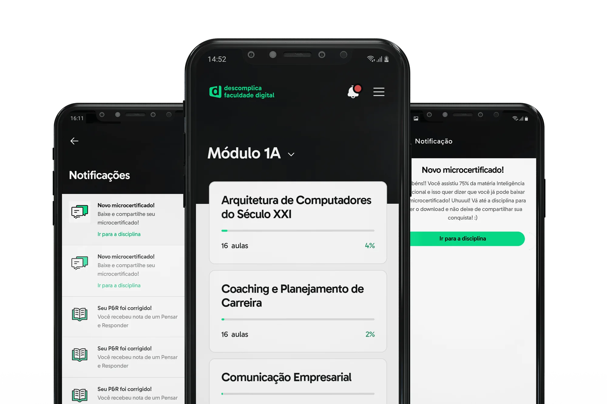
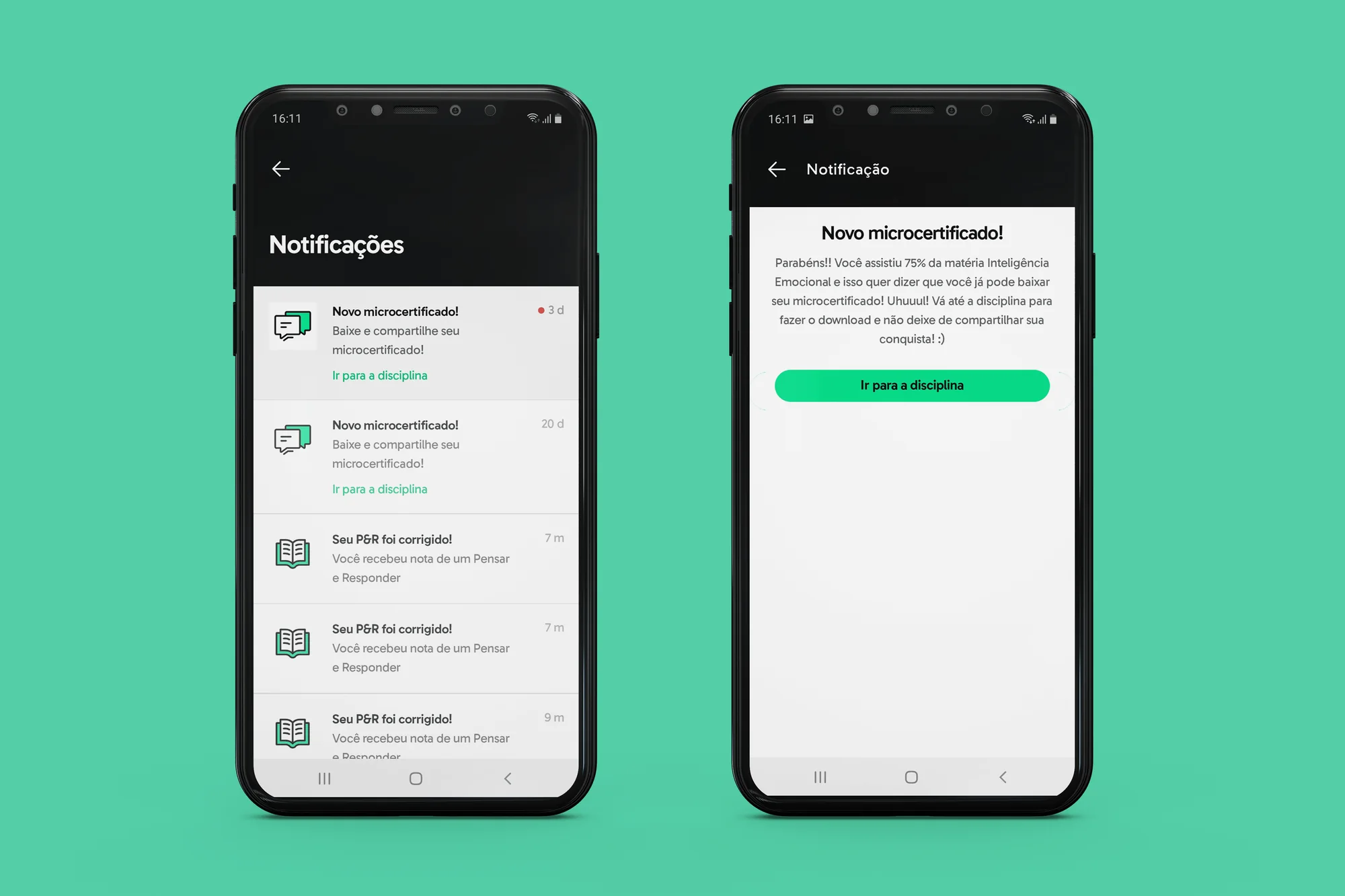
Notifications already existed on desktop. My job was to work out how they should behave in the app: what to show, how to group and prioritize it, and how it fits native navigation on iOS and Android.
We shipped it first to a beta group of students so we could learn before a full release. Feedback was positive, so we rolled it out to everyone and followed up with a survey: 80% of students approved the feature, and we saw more students engaging and completing activities in the app.
Push Notification Strategy
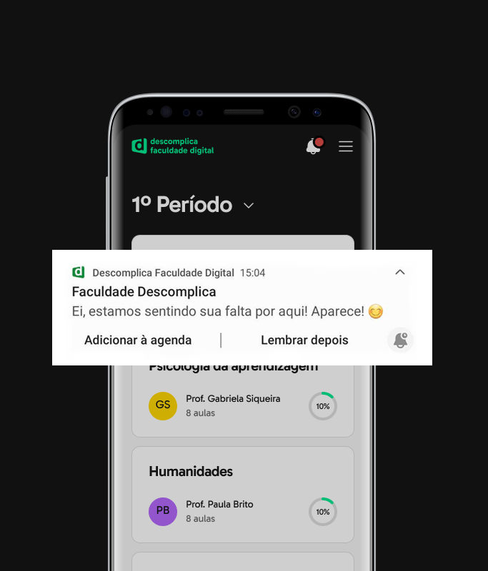
While engineering built in-app notifications, I researched and defined the strategy for push notifications.
Push is a powerful engagement lever, but it’s costly when misused: too many, or at the wrong time, and students silence them or delete the app. The strategy focused on frequency and timing, so every push earned its place.
It followed the same principle as the rest of the work: help students do everything they needed in the app, without depending on the desktop platform — while keeping the app light enough for the older devices many of them used.
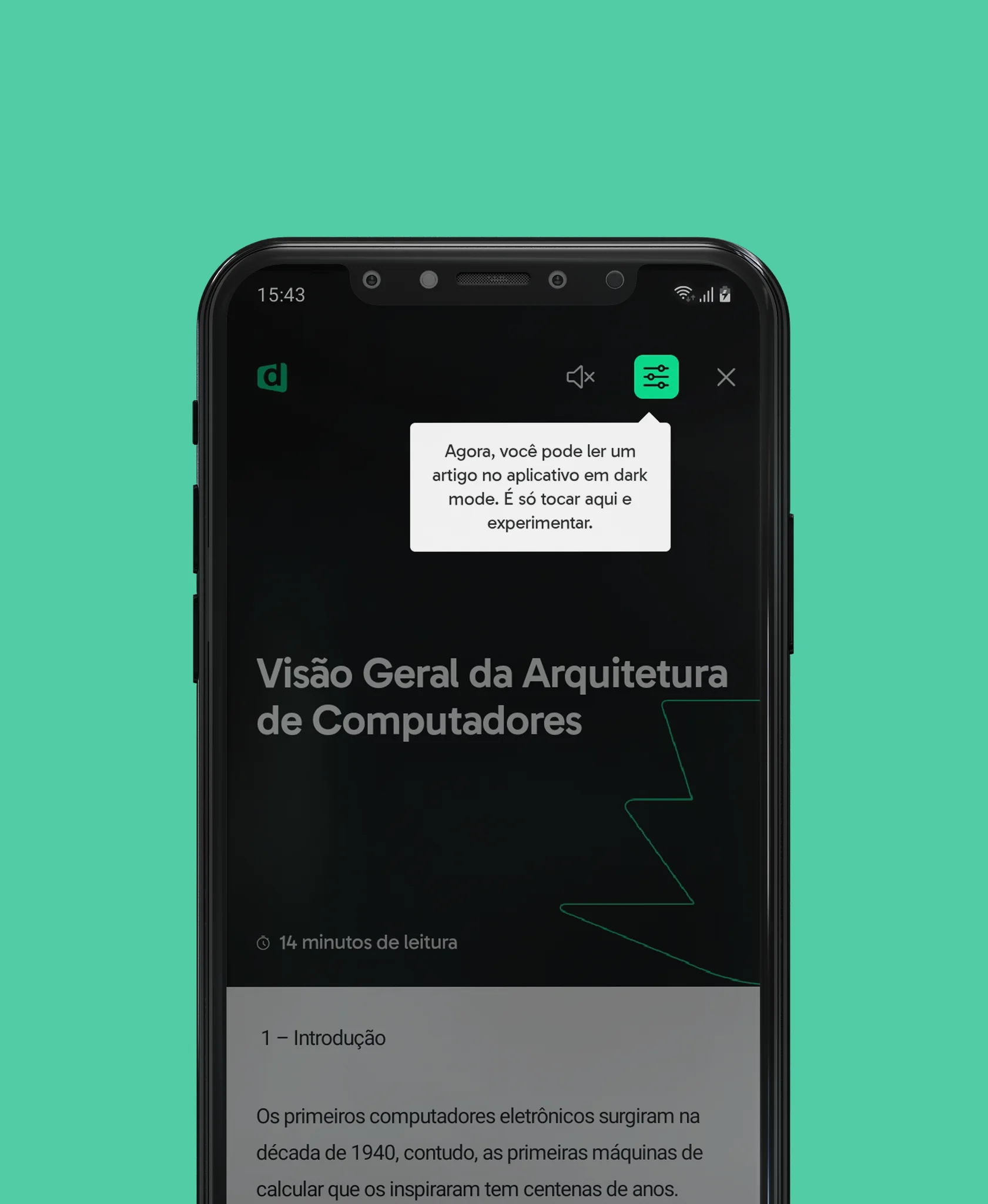
Dark Mode & High Contrast
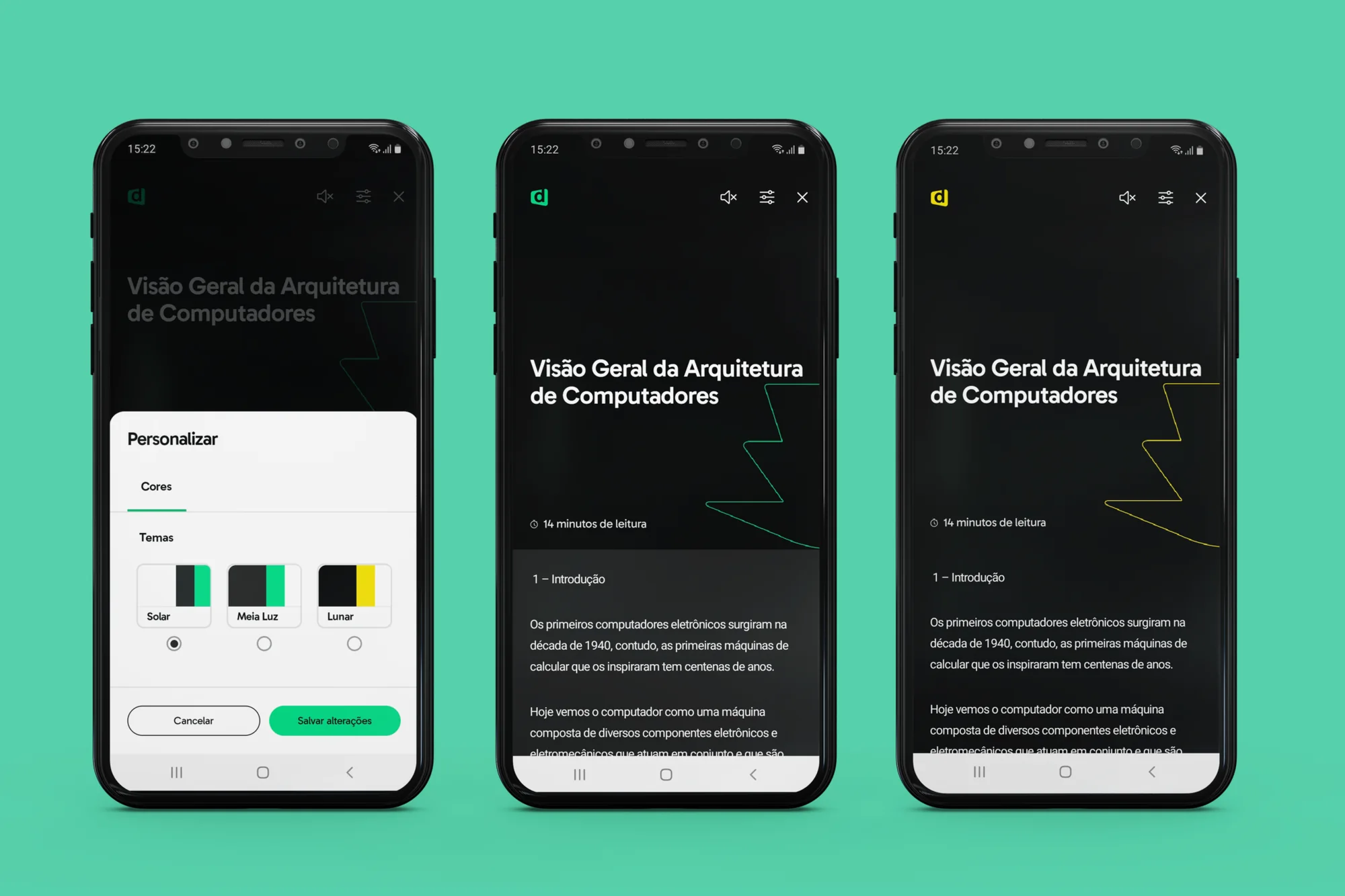
Reading long course summaries on a bright screen is tiring, especially in dim light. I designed an initial dark mode for the summaries reader.
Working with the accessibility team, I studied color modes and also designed a high-contrast mode for students with low vision or color vision deficiencies — so the same content works for more people, in more contexts.
Audio & Offline Learning
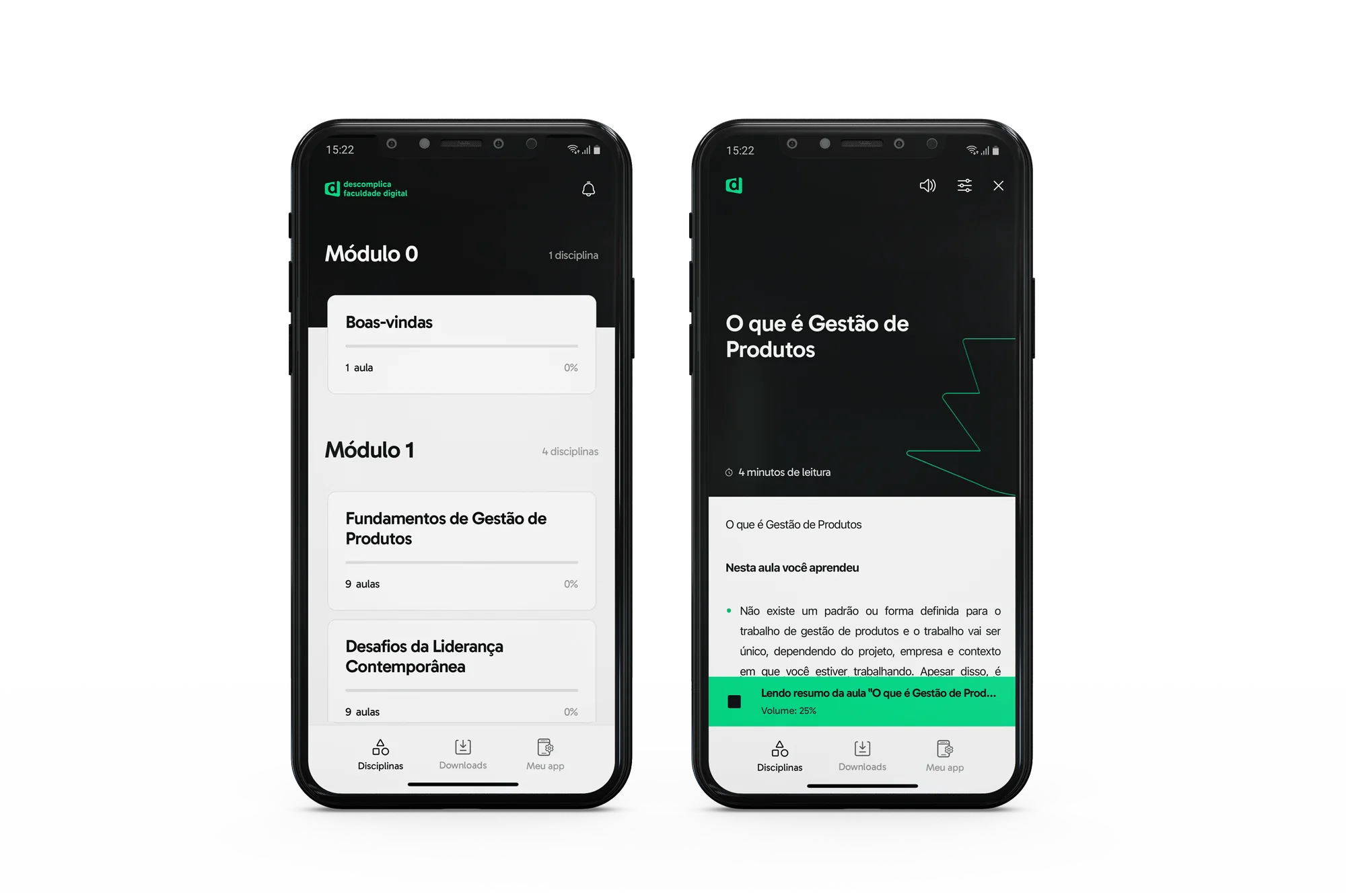
For students studying on the commute or at the gym, reading isn’t always possible. We designed and shipped audio versions of the lesson summaries, along with an in-app player, so students could keep learning with their eyes and hands busy.
The player sits as a compact bar above the navigation, showing what’s playing and the volume, with a single control to stop. Students can keep browsing their courses while listening, instead of being locked into a full-screen player.
Alongside it, I redesigned the bottom navigation around three clear destinations — Courses, Downloads and My app. Downloads let students save lessons and study offline: on the commute, with unstable connections, or without spending their mobile data.
Tooltips for New Features
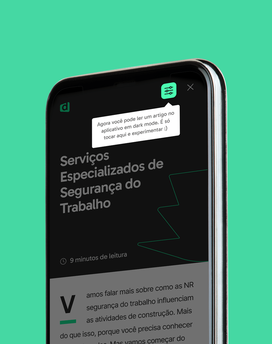
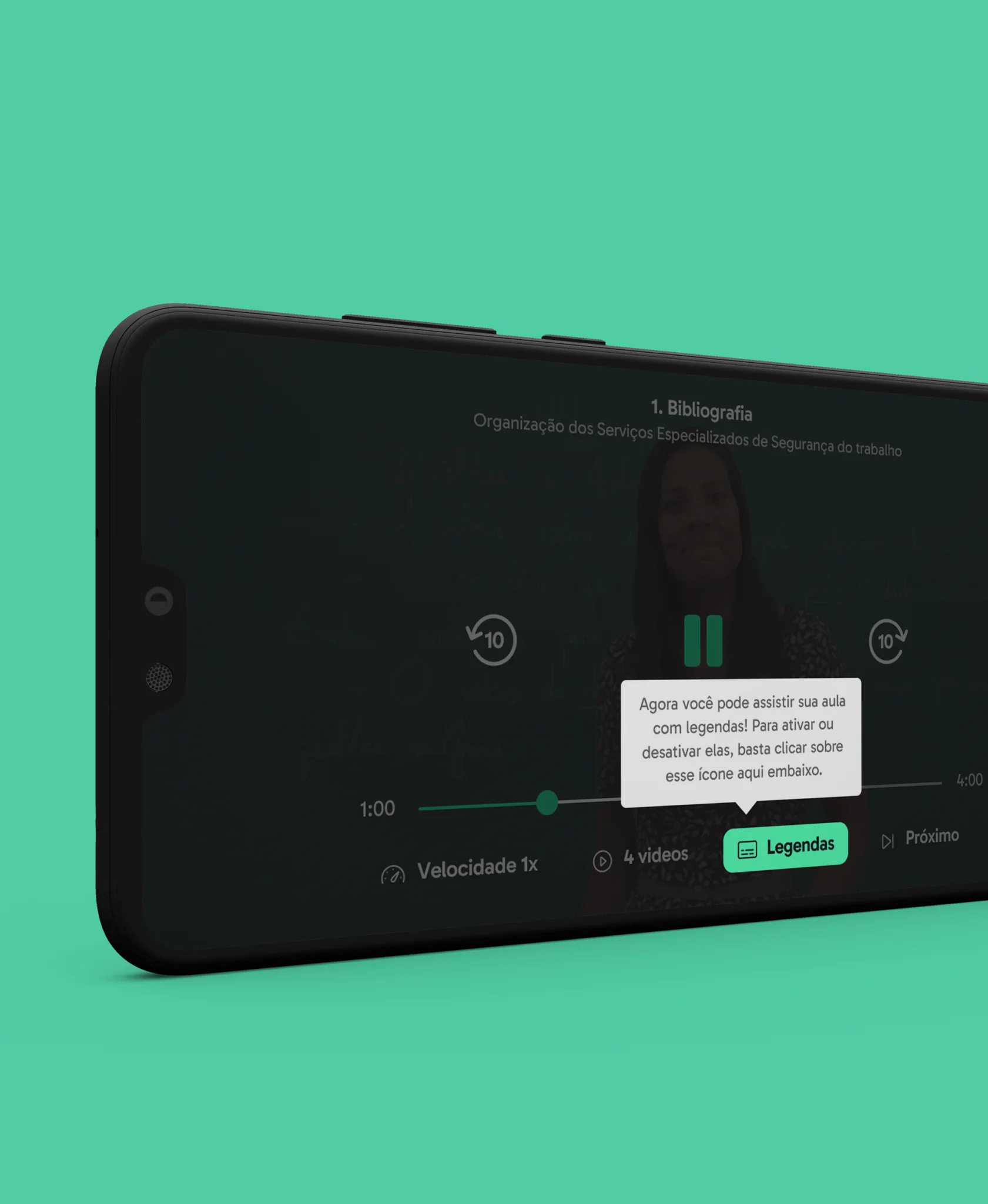
New features only create value if students find them. I proposed a lightweight tooltip pattern that introduces new features and updates in context, right where students use them.
It gave the squad a reusable way to announce releases — first used for dark mode and subtitles.
Results
- 80% approval in the beta survey for in-app notifications, which then rolled out to all students.
- Contributed to a 20% lift in student activity in the app and an increase of at least 70% in student satisfaction.
- Audio content, an in-app player and offline downloads let students keep learning on the move.
- Dark mode and high-contrast mode made the app usable in dim light and for students with reduced vision.
- A reusable in-context pattern for announcing new features.
Reflection
Interviewing students showed me how much the context people live in shapes the way they use an interface. Many of them had only small windows of time in their day to study, and the app’s job was to help them stay engaged — and not drop out of their courses.
The most important lesson was that they didn’t want more features. They wanted the app to be more useful, easier to access and adapted to their habits. That changed how I prioritize: before adding something new, I ask whether it fits the moments people actually have.