
UX/UI Design · Information Architecture
Futura Genetics
Restructuring a genetic-testing website so dense scientific content became a clear path from first visit to customer.
- Company
- Futura Genetics
- My Role
- Product Designer (UX/UI)
- Timeline
- Jan 2019 — Jan 2020
- Platforms
- Website, Desktop & mobile
- Team
- CEO, project manager, marketing, tech lead, developers
- increase in the perceived reliability of the services
- 40%
- key page types redesigned or created from scratch
- 6
Overview
Futura Genetics is a digital health platform powered by genomic data. Through life insurers, it offers clients a personalized DNA report that motivates them to act on their health.
Over one year, I owned the end-to-end redesign of the company’s website as its Product Designer — from information architecture to responsive UI — working weekly with the CEO and closely with the project manager, marketing, the tech lead and developers.
The Challenge
The company had a single landing page that didn’t explain the service. Visitors couldn’t easily find out what the test covered, what they would receive, or why they should trust a young company with their DNA.
The content itself was hard: genetics is dense and scientific, and the audience wasn’t. In a product like this, trust and clarity are what turn a visitor into a customer. The new site had to take a non-expert from “what is this?” to “I understand what I’m getting” — while also giving the company a credible presence for partners and investors.
How I Worked
There was no budget for formal user research, so I built the direction from the inputs available and validated it along the way:
- Weekly sessions with the CEO to align on business goals, priorities and how the product should be positioned.
- Collaboration with marketing and the project manager on content, messaging and what customers were asking.
- Competitor research on other genetic-testing companies, to understand how they explained results and built trust.
- Feasibility checks with the tech lead and developers before designs were finalized.
- Testing design alternatives with the internal team and customers to compare options before rolling them out.
Where It Started
The old site tried to say everything at once. Long pages stacked stock photos, partner logos, lab credentials, events and repeated calls to action, so the key messages — what the test covers and what you receive — got lost. Thin, light text over photos and pale teal on white also made much of the content hard to read, which undermined the very trust the company needed.
Restructuring the Information Architecture
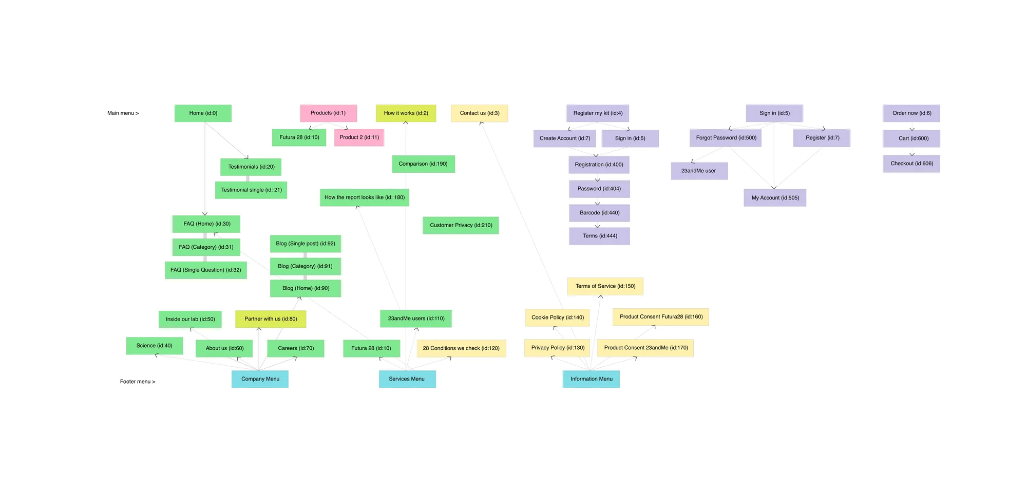
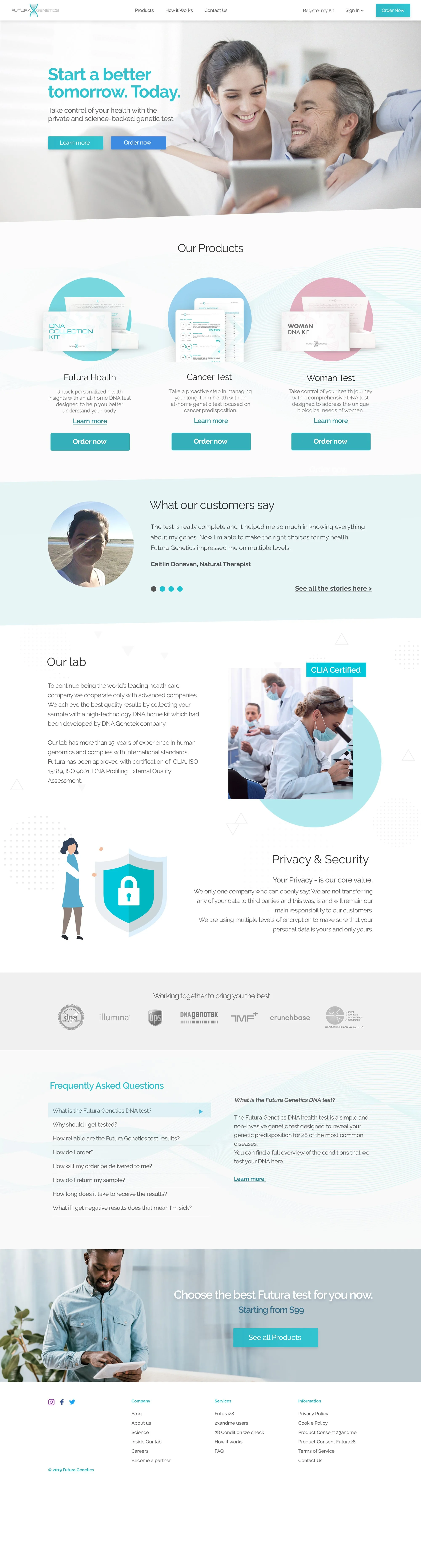
The biggest change wasn’t visual. I rebuilt the site structure around the questions a visitor actually has, in the order they have them: What is this? What does it test? What will I receive? Can I trust it? Each question became a clear section of the site, instead of everything competing on one landing page.
A Homepage That Explains
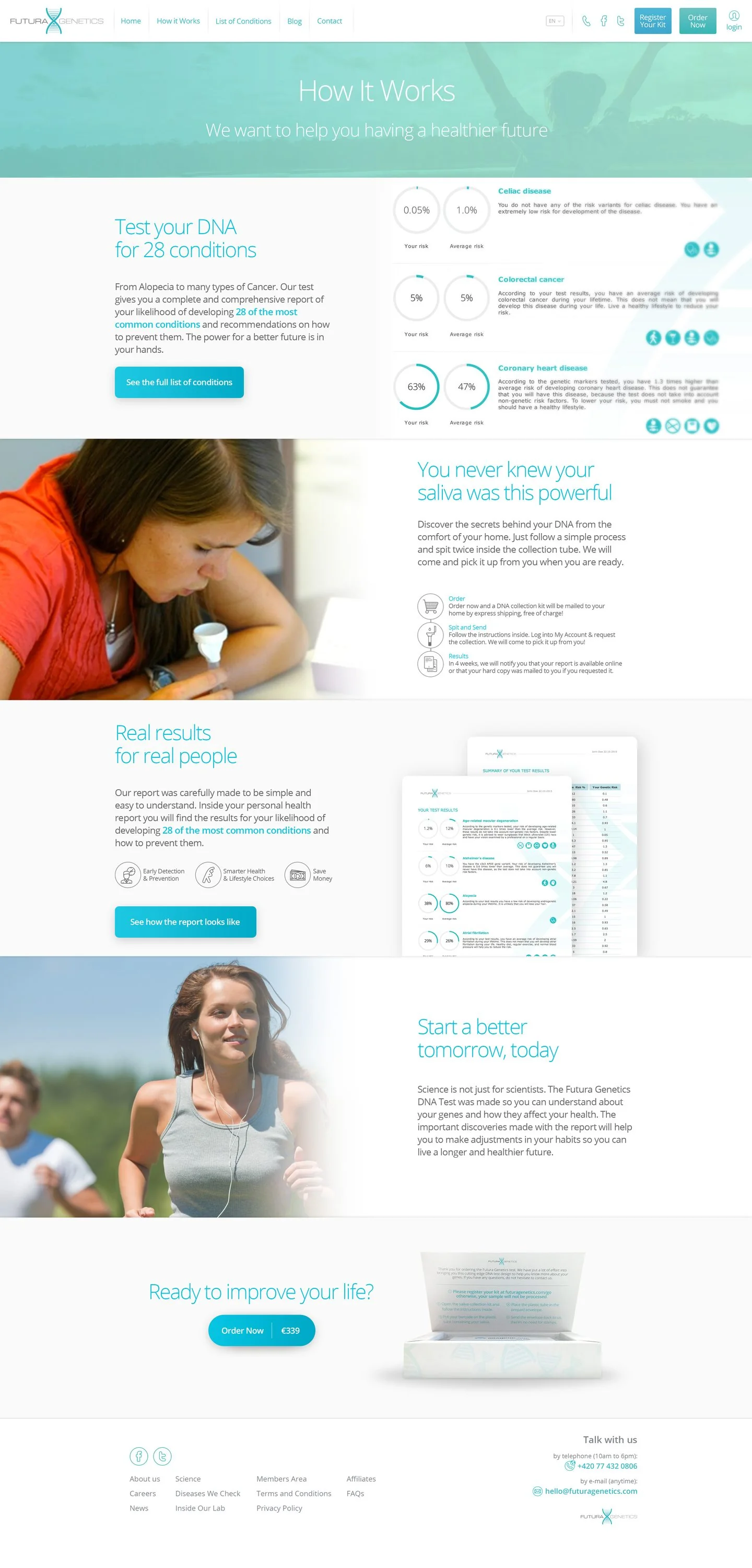
The new homepage introduces the product, how it works and what makes it trustworthy, then routes visitors to the section that answers their next question.
Every Condition, Explained
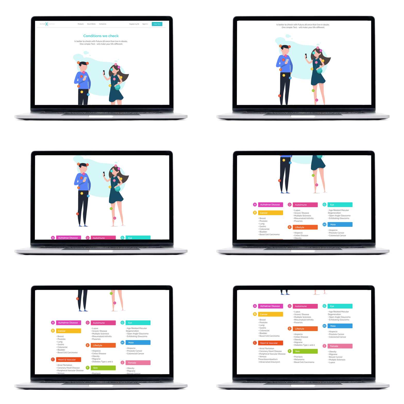
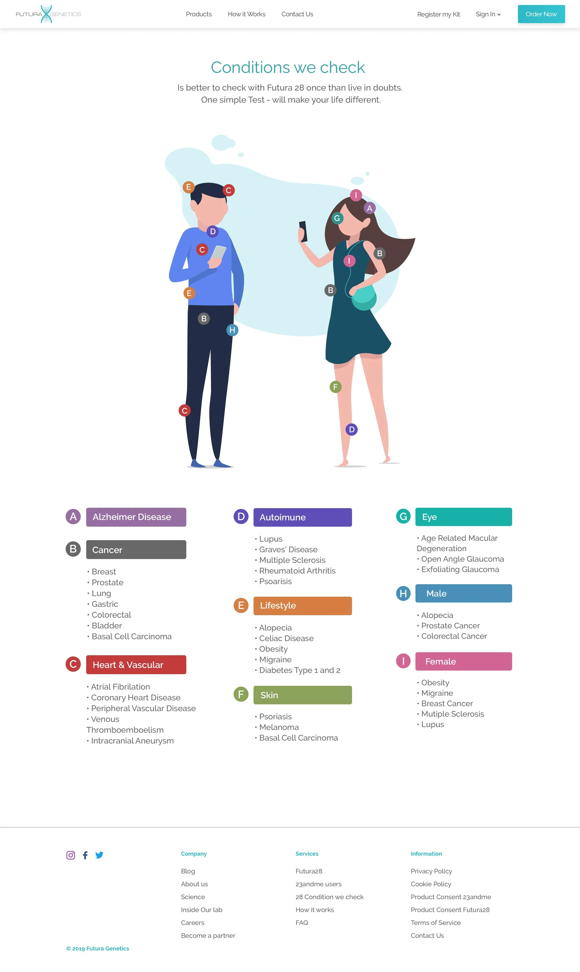
A dedicated page listed every condition the test covered, so visitors could see exactly what the report would tell them before buying. Instead of one long list, I grouped the conditions into categories — like cancer, heart and vascular, autoimmune, lifestyle, eye, skin, and male and female health — and mapped each category onto two illustrated figures, making a dense medical list approachable at a glance.
Understanding the Report
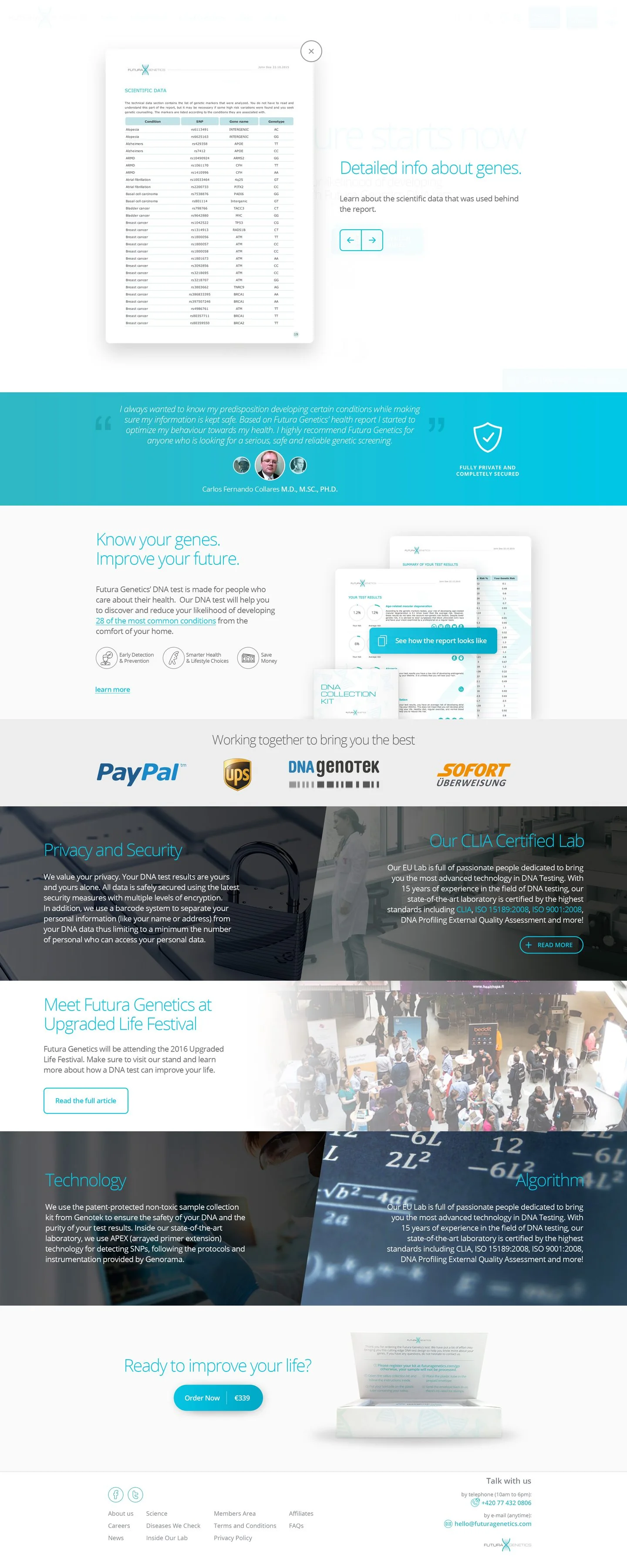
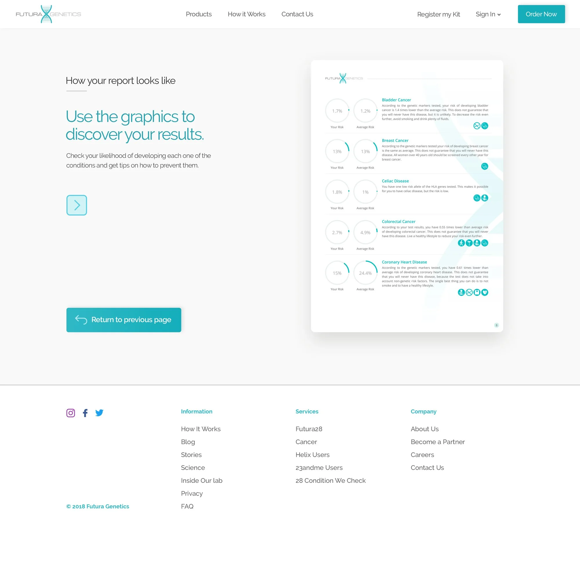
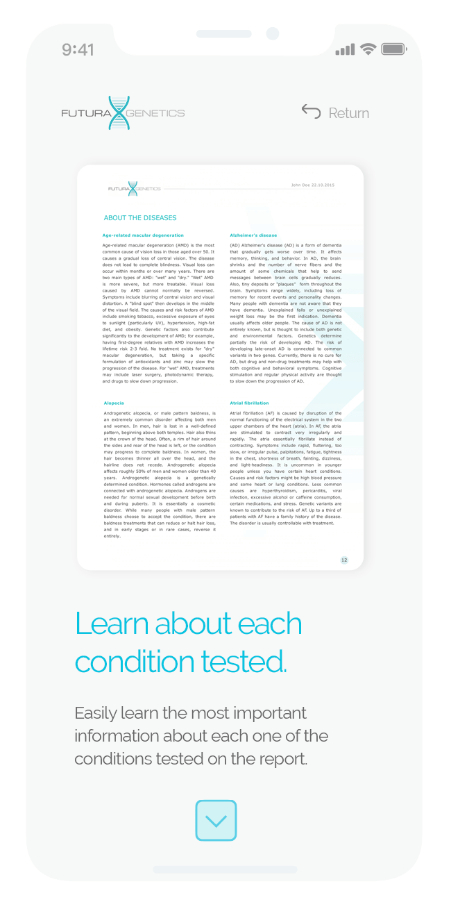
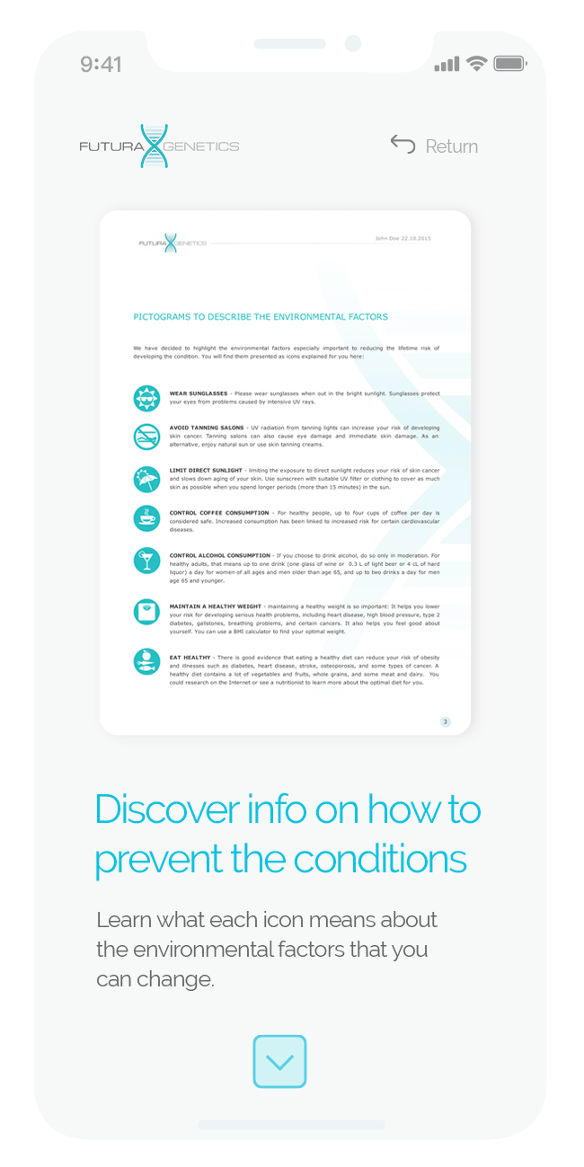
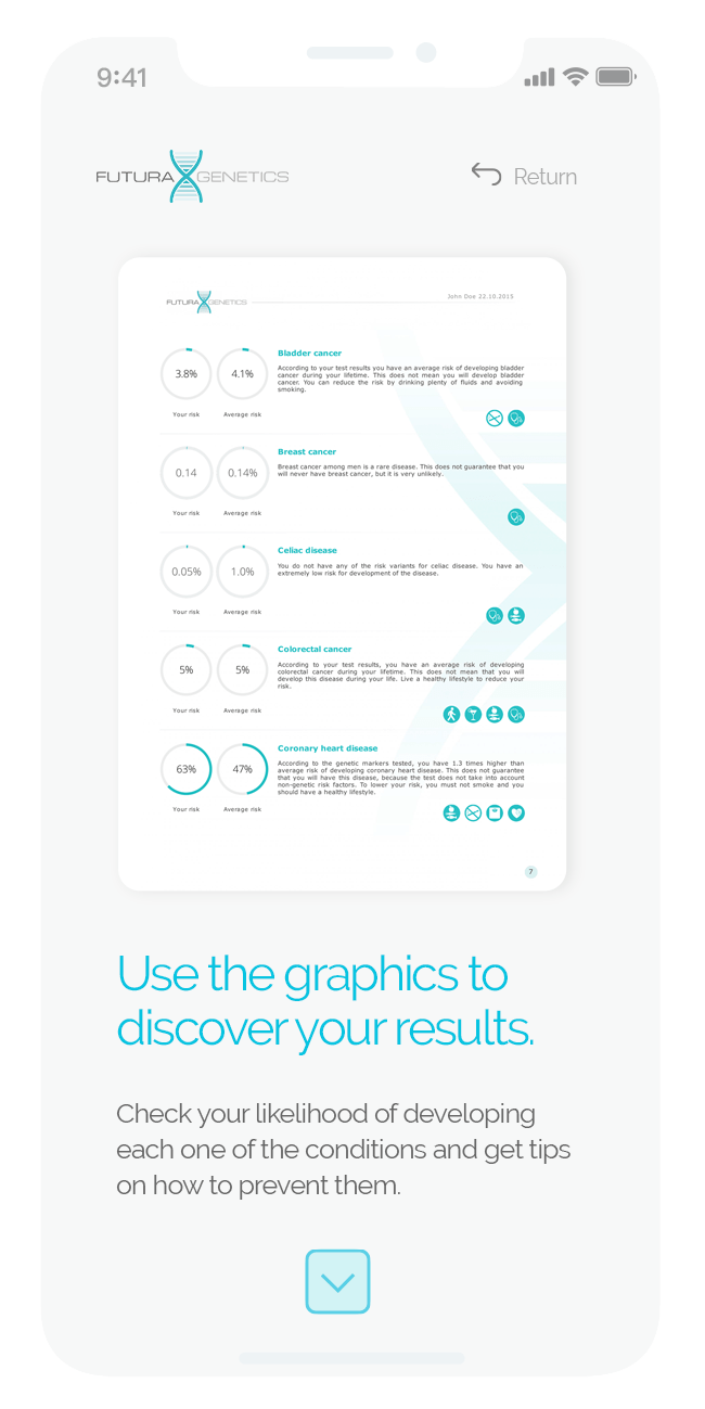
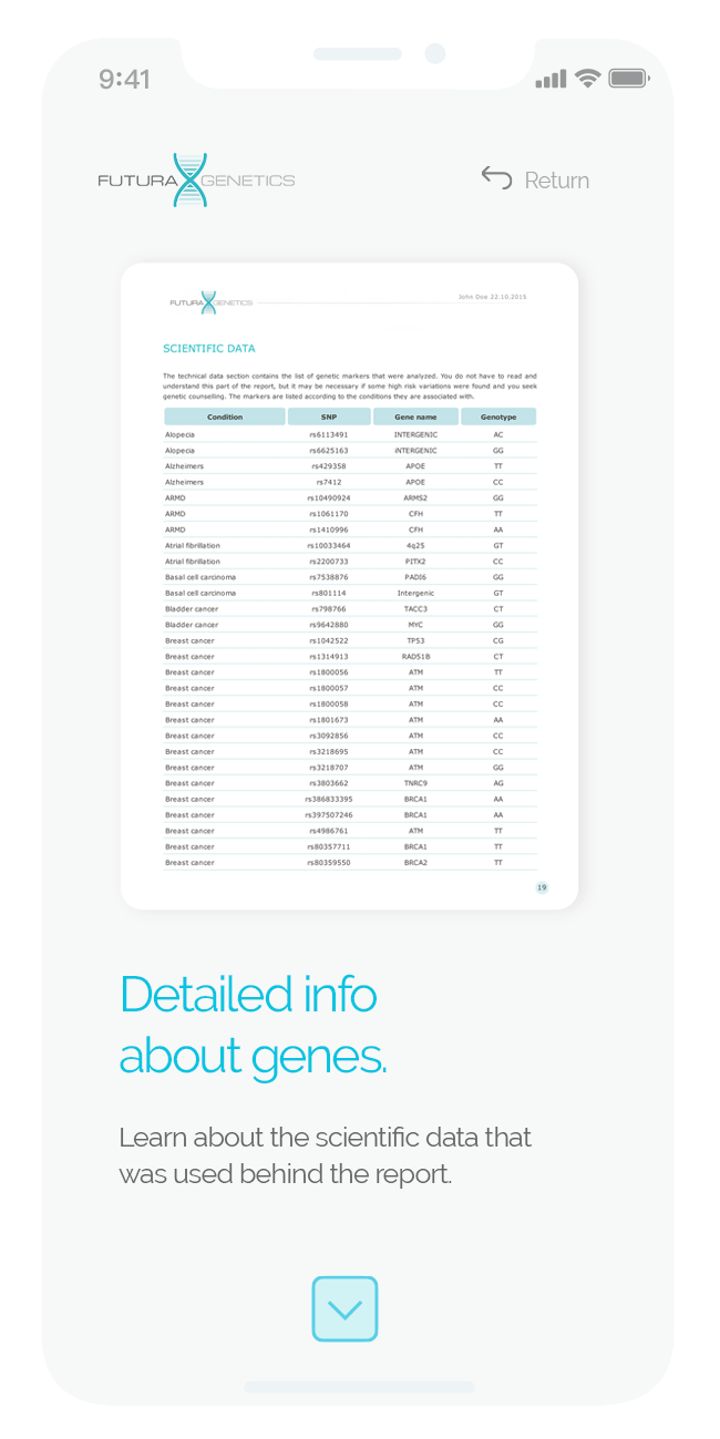
Before buying, people want to know what they will actually get. I designed a dedicated section that walks through the report — how to read the graphics, the detailed results by gene, and what each condition means — on desktop and mobile.
A More Complete FAQ
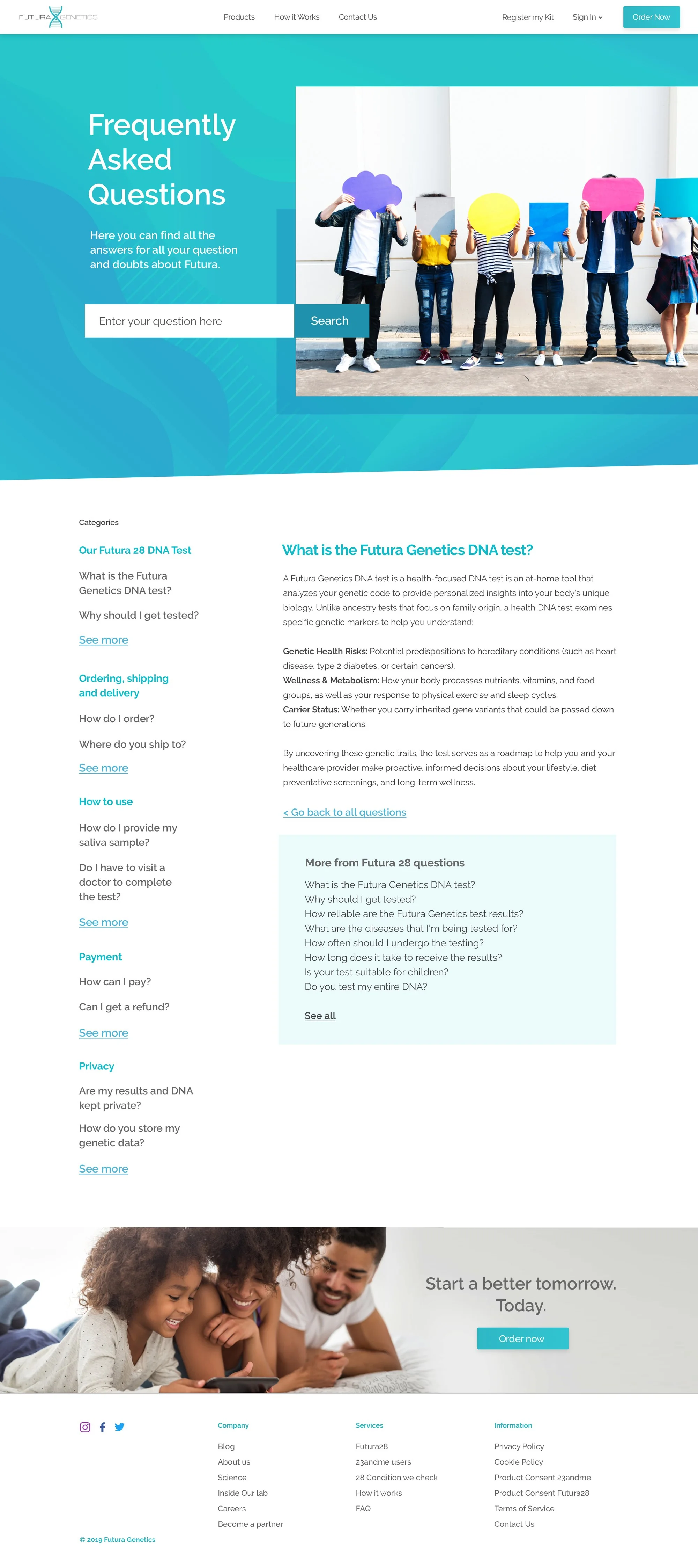
I reorganized the FAQ around the moments in a customer’s journey — the test itself, ordering and delivery, how to use the kit, payment and privacy — and added search. Each question got its own page, with related questions alongside, so answers were easier to find and one answer led naturally to the next.
Building Trust
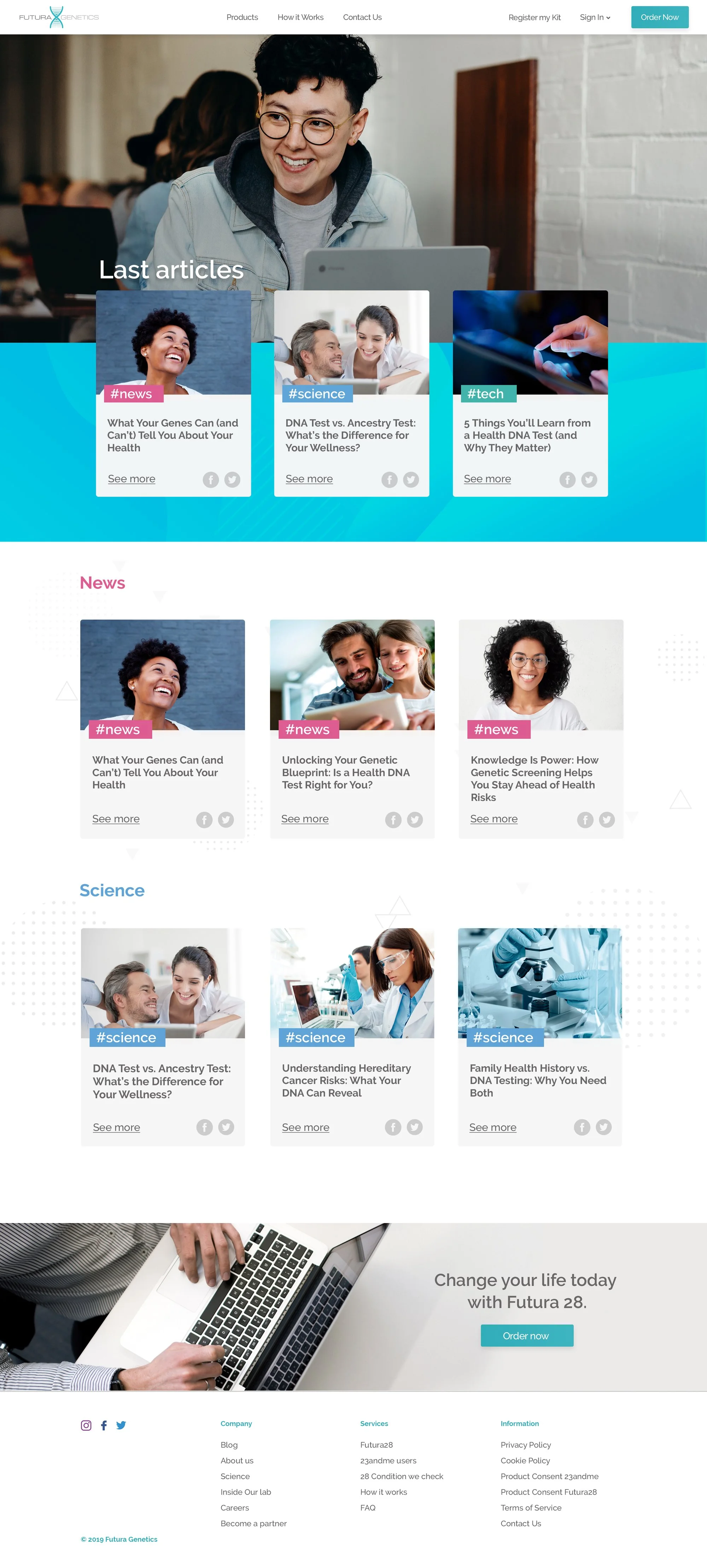
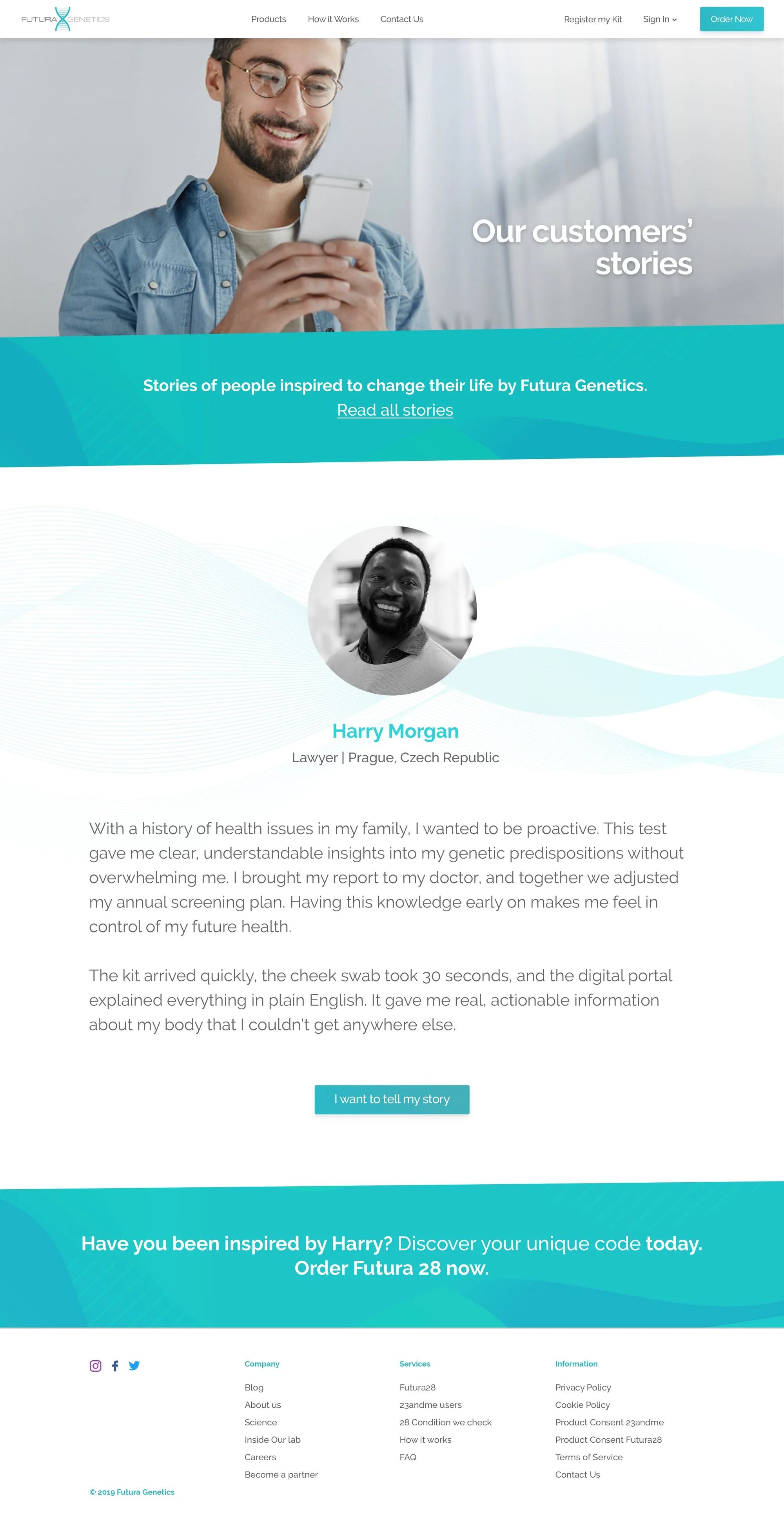
A blog and customer stories gave the company a voice and social proof — both essential when asking people to share their DNA.
Results
- 40% increase in the perceived reliability of the company’s services, measured by testing the new design with the internal team and customers.
- A clear structure that took visitors from a single landing page to a full site answering their questions in order.
- A responsive design that carried the same clarity to mobile.
Looking Back
This was an early project in my career, and it taught me how much structure matters before visuals: most of the clarity came from reorganizing content, not from styling it.
If I were doing it today, I would bring users in much earlier — interviewing customers about their questions and worries, validating the new structure with card sorting and tree testing, and defining success metrics like conversion from the start, not only at the end.